Table of Contents
{$page}
The artwork approval portal is a CloudApp website used by a customer contact to approve artwork. It does not require a user login, but uses a “Fat URL” to identify the customer and the order.
Each URL is uniquely associated with one Order and one Customer Contact. If multiple contacts are added as approvers, then multiple unique URLs are issued.
Access to artwork approval via the anonymous portal is always limited to the artwork from one order. All the artwork for that order can be approved or rejected, but access to anything else is prevented (even if it is for the same contact).
Once artwork is approved, rejected, or changes are requested, the status cannot be changed within the portal.
Features
The portal CloudApp supports these features:
- The ability for a contact to issue one of the allowable decisions on an Artwork Group:
- Approved
- Rejected
- Request Changes
- The ability to view and add comments to an artwork item consisting of:
- Text
- The ability to view and approve all artwork for an Order
- Prevent any changes in artwork status once a decision is made.
- Provide a Contact Us information screen.
Mobile Pages
The mobile version of the cloud app consists of the following pages:
Welcome Page
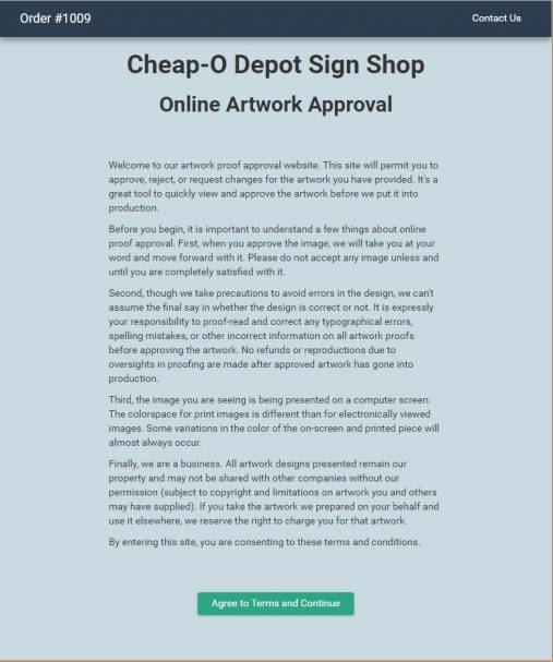
The Welcome Page is the landing page where inbound requests are connected to.
The page consists of the following elements:
- Header - The name of the business.
- Terms of Use Text - The text from artwork setup that the user must read and approve to continue.
- Agree and Continue Button - The button the user clicks to advance to approving the artwork. This button takes the user to the Order Artwork Approval page.
Contact Us Page
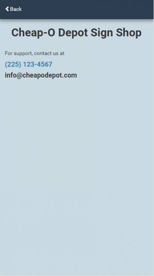
The Contact Us Page provides contact information for your company to the user.
The page consists of the following elements:
- Header - The label Contact Us. The Back button returns to the screen from which the user came.
- Company Name.
- Phone Number - pulled from the main business phone number, hyperlinked to invoke the user's phone.
- Email Address - pulled from the main business email address, hyperlinked to invoke the user's email system.
- OK Button - same as back; returns the user to where they came from.
Individual Order Artwork Listing Page
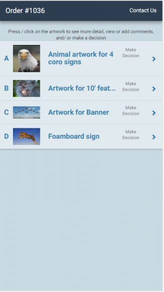
The Individual Order Artwork Listing page lists all of the artwork (groups) for a single order. Next to each artwork the decision status of the artwork is shown.
The page consists of the following elements:
- Header - The Order number and a “Contact Us” button which takes the user to the Contact Us page.
- Artwork Label - showing “Artwork for Order #1234” or “Estimate 1234” as applicable.
- Artwork Groups - Each artwork group is listed with the following attributes:
- Thumbnail - A thumbnail image is displayed. For Artwork Collections, the first image is displayed.
- Description - The artwork description is displayed if present. If not present, the line item description for the first line item in the group is displayed.
- Decision Status - The decision status for the artwork.
- Chevron - This navigates to the Artwork Detail screen for the first artwork item in the group, or for the Approved Option“ if applicable.
This page always shows, even when there is only one artwork group. When an artwork group is chosen, the Detail Page for Single Images is displayed if there is only one image. The Detail Page for Multiple Images is displayed when there are more than one image.
Artwork Detail Page for Single Artwork Image
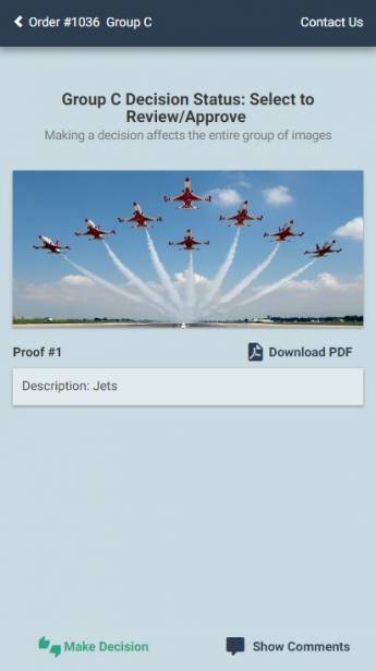
The artwork detail page displays the artwork in the group. When there is only 1 artwork in the group, the detail page begins directly with the artwork image and navigation for additional artwork is not shown.
Page elements include:
- Header - The description of the Artwork Group is the main text. The left chevron navigates back.
- Image Label - Labels the Artwork Group and the current Decision Status.
- Artwork Image - The artwork image, scaled proportionately to fill the available screen height or width.
- Comment Identifiers - Comment identifiers (lines, rectangles, and pins) are shown but the text associated with comments is not shown until the “Show Comments” button is clicked.
- Toolbar - The options toolbar with buttons:
- Make Decision - opens the screen where you can approve, reject, or request changes to artwork.
- Show Comments - hides and reveals the elements to the screen. See View/Add comments screen.
Note: Comments can only be added when the Artwork Group’s status is “Pending Approval”. For other statuses, existing comments are shown but no new comments can be added.
Note: The Approve/Change button is only accessible to the Approver.
Artwork Summary Page for Multiple Images
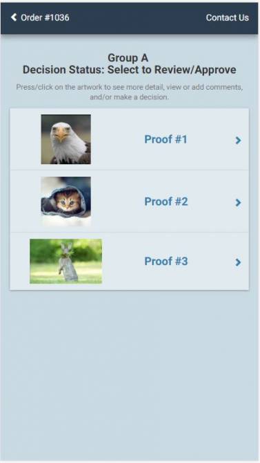
When there are multiple artwork images in the group, the initial detail page shows all of the artwork choices.
Page elements include:
- Header - The description of the Artwork Group is the main text. The left chevron navigates back.
- Decision Status - Displays the current Decision Status of the displayed artwork group.
- Help Label - A label that displays the following message, “Press/Click on the artwork to see more detail, view or add comments, and/or make a decision.”
- Artwork Labels and Images - The artwork image, scaled proportionately. The display should fit at least 2 artwork images across and may require vertical scrolling. The artwork label should display the individual artwork description if present, or Image/Option #X.
Clicking on the image or image label navigates to the Artwork Detail for that image.
Single Artwork Detail Page when Multiple Images
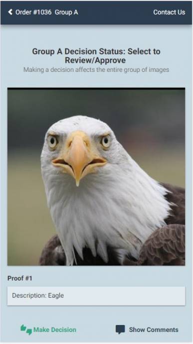
When there are multiple artwork images in the group, and one of the images is selected, the Artwork Detail Page takes on a few alternate options.
Page elements include:
- Header - The description of the Artwork Group is the main text. The left chevron navigates back.
- Decision Status - Displays the current Decision Status of the displayed artwork group.
- Artwork Labels and Images - The artwork image, scaled proportionately. The display should fit at least 2 artwork images across and may require vertical scrolling. The artwork label should display the individual artwork description if present, or Image #X for Artwork Collections.
- Toolbar - The options toolbar with button:
- Make Decision - opens the screen where you can approve, reject, or request changes to artwork.
- Show Comments - hides and reveals the elements to the screen. See View/Add comments screen.
When dealing with multiple Proof Files in a group, the artwork group will be designated as:
- Artwork Collection - This option indicates that ALL the artwork items represent the final image and are approved or rejected collectively.
View/Add Comments Page
To access the comments or to add new ones, clicking on the Show Comments icon at the bottom will alter the screen:
- The text on the Show Comments button changes to Hide Comments.
- All headers, including the navigation header, are hidden.
- A Comment Toolbar appears at the top with the following icons:
- View Comments
- Add Text Comment
Touching a lettered comment icon anywhere on the screen shows the comment in a bubble referred to as a Comment Pop-Over. Only one comment pop-over is shown on the screen at any time, so opening another automatically closes any that are open. Clicking on the X or clicking on the letter icon again also closes the pop-over.
There are several types of comments that a user can add. These include:
- Text Comments
The use and representation of these comment on the image as described below. Additional comment types (freehand, highlight, etc.) may be added in future versions but are not supported in the initial release.
Note: Comments can only be added when the Artwork Group’s status is “Pending Approval”. For other statuses, existing comments are shown but no new comments can be added.
View Comments
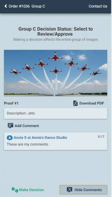
When the page opens, the comments are automatically displayed. The View Comments button is used to toggle the comments and hide them from the screen.
The Scroll Region shows all comments on the image and are shown in reverse chronological order (most recent at the top). The date, first name, company, and message should be shown in the list. Click behavior in the Scroll Region follows these rules:
- Clicking on any comment in the scroll region causes the pop-over comment to also appear over the image, acting the same way as clicking on the comment letter on the image.
- Only one pop-over comment is visible at a time, so if one is already open that one is closed first.
- Clicking a comment that is already being shown in a pop-over closes the pop-over.
- Clicking on the commenter's name shows a Commenter Information Pop-over with their full name, email address, and the phone numbers. For contacts, the contact phone number(s) are shown. For employees, the business phone number is always shown. The user should be able to dial or email directly from this screen. Only one Commenter Information Pop-over should be visible at a time - opening another closes any currently open.
Add Text Comments
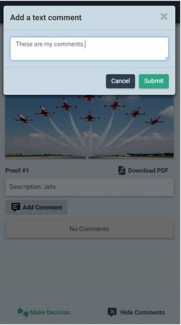
Text Comments are used to add comments about the image that are not specific to a place on the image. Text comments are indicated with a single yellow “note” icon on the top right of the image, and contain the comment letters of ALL text comments (which may be abbreviated with … if space does not allow them to all be listed).
When a user clicks to add a text comment, a dialog opens up over the image to allow the user to enter their comments. While adding a new comment, all existing comments on the image are hidden. When the user clicks save (or clicks the x or clicks off comment box with it empty), the comment indicators on the image are shown again.
Decision Pop-Up
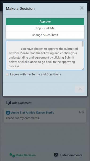
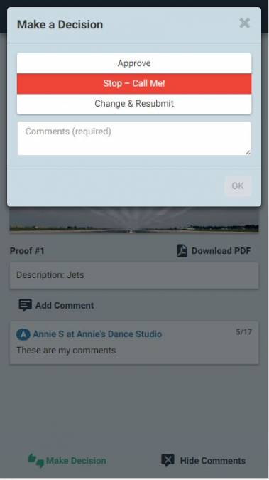
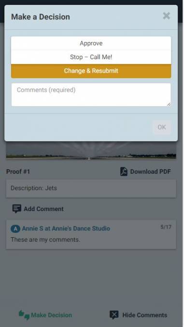
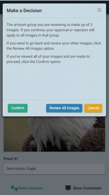
The Decision Pop-up is displayed when the Approver clicks the Approve / Change button on the artwork detail screen. The Decision Pop-up displays different choices for artwork that is the only artwork present or part of an Artwork Group or Artwork Collection, but the basic options are:
- Approve
- Reject (Stop-Call Me!)
- Request Changes (Change & Resubmit)
The Request Changes options may be disabled in the artwork setup screen in Control. The text for the different options may also be modified on the setup screens.
Notes:
- Only Approvers can make decisions.
- The background color of the pop-up changes based on the selection the user makes.
When the user chooses one of the available options, the Submit button is enabled. When Approve with Changes or Change and Resubmit is chosen, an additional text input box appears. This text, if entered, is added to the artwork as a text comment.
When the user clicks on the Submit button, the status of the artwork group is updated and the screen navigates back to the Order Artwork Listing page (which is updated for the current status).
Note: The additional notes entry field is intentionally not displayed for “Approved” or “Choose this Option” since these comments might not be seen before production. The notes entry field is displayed and required for all other choices.
Online Artwork Terms and Conditions Screen
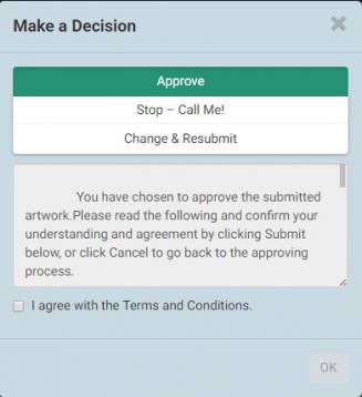
When the approver selects Approve or Chooses an option, a confirmation screen appears that displays the terms and conditions for online artwork approval. The approver must tick the “[x] I agree to these terms and conditions” checkbox and then click the Accept button. If the approver clicks the Cancel button, she or he is sent back to the decision popup.
Source
Contributor: Cyrious Software
Date: 08/02/2016
Version: Control 05.75
See Also
- Backlinks include_pagepage_componentbacklinks